
Fable Web Components
Web components allow us to create custom HTML elements with custom behavior. HTML was originally designed primarily for documentation purposes with some form controls. Then by using CSS, we developers attempted to style the page and give the looks that we wanted. With HTML 5, new “web components” came up such as dialog and progress. But they are somewhat limited and due to that HTML language is almost transformed into the assembly language of the web developer. We tend to abstract and stay away from HTML and treat it as a second class citizen where we hook into our shiny SPA web frameworks. We look at the job ads, no one is searching for an HTML developer anymore but they look for React devs, Angular devs, Vue devs. 10 years ago, it was hard to land a job if you didn’t know jQuery, 5 years ago it was Angular that recruiters wanted and the developers have been turned into hamsters running in a circle. Perhaps it is time to revisit the fundamentals, give HTML some respect and treat it as a first-class citizen. Web components are an attempt to give that respect back to it.
In this post, we are going to develop a Modal Window web component.
You can also find the full source here. Although web components are meant to be written via JavaScript, there is no reason not to do it from Fable. This post will also demonstrate some more capabilities (and limitations) of Fable in terms of JavaScript interop.
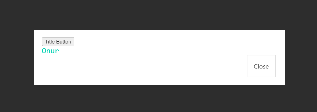
And by the way, this is the final markup that we are going to use at the very and as our web component:
    <modal-window visible onclose='alert(this.tagName)'>
        <span slot="title"><button onclick="this.parentNode.parentNode.close()">Title Button</button></span>
        <span slot="description">Onur</span>
    </modal-window>
Parts of Web Components:
Basically, web components have 3 ingredients:
-
A custom element class: You create an ES 6 class with some special named members.
-
Shadow DOM: Web components live in a concept called shadow dom. shadow dom is like an independent HTML root, you could imagine it something like an iframe but unlike iframe, it is still an integral part of the page. In general most CSS styles cannot transcend upwards or downwards through the shadow dom with the exception of things like color and event bubbling still works
-
HTML Template: Basically a string of HTML markup, which can include the styling, that will compose our control
Once we gathered the ingredients we register our tag and use it.
Why use web components?
This common question arises, as we could do all complicated dynamic stuff by using our fancy SPA frameworks.
Well, the first benefit is your components become framework agnostic. Since the final output is HTML, once you have written a web component it can be easily consumed by React, Angular, Vue or Web assembly.
The second benefit is, web components give you a shadow dom which allows you to hide the CSS classes into the component. So that, you could have truly isolated CSS styling as CSS styles outside of the shadow dom won’t penetrate inside and the ones inside won’t be leaking to the outside of the shadow dom.
Another great benefit is for designers. Whether you use react, angular or fable a common problem is that you start to write your HTML with the SPA’s language with extra augmentations such as JSX or full Fable F# syntax, and then if you have an HTML designer who is not familiar with F#/react, etc in your team, it becomes a problem to sync the designer’s code with your own code. To solve this problem Shadow DOM gives you HTML slots, which allow you to treat HTML as a native templated language with default looks. We will investigate slots briefly in our example below.
We already have React, Angular, Vue. Are web components an alternative?
React, Angular, Vue, and web components are complementary, not rivalry. That is, you can write web components that are rendered via react. Then you can re-consume the custom HTML element from React, like a sandwich.
React –> Html Web Component –> React
This way you can end up with SPA framework-agnostic components and you can use your SPA where it is needed, that is primarily templating your data, not the looks.
How do I build web components with Fable?
After going through the above intro now let’s get our hands dirty. I have already shared an example Modal Window web component and for the rest of the post we will do a walk-through the code.
Firstly, we have a reusable WebComponent module which is the basis and encapsulating common code for our future web controls.
At the top, we create a template element in Fable way as they are missing in Fable library. This for getting type safety and auto-complete.
    [<AllowNullLiteral>]
    type HTMLTemplateElement =
        inherit HTMLElement

        abstract content: DocumentFragment with get, set

    [<AllowNullLiteral>]
    type HTMLTemplateElementType =

        //cool way to generate the constructor
        [<EmitConstructor>]
        abstract Create: unit -> HTMLTemplateElement
Next we need a shadow dom type and we define it as below:
    //We create our own ShadowRoot to interact with browser api.
    [<Global>]
    type ShadowRoot() =

        member this.appendChild(el: Browser.Types.Node) = jsNative

        member this.querySelector(selector: string): Browser.Types.HTMLElement = jsNative
Again this is primarily for type safety and auto-complete support while interacting with Browser’s DOM API. Notice the global attribute. This is to say Fable, don’t generate code for this type, it already exists in the hosting environment in this case the browser. And members are not mangled. Mangling is a mechanism in fable that would change the actual generated member name in order to support things like overloading. Obviously no code is generated here.
The HTML specification says, in order for web components to deal with its attributes we need a specially named member observedAttributes and this member should be static getter property. As mentioned above, Fable by default, mangles all property names with some $ and numerical symbols unless the member is virtual or an interface member. To work around the issue we need some helpers to generate static getters. And here’s the code for it:
    //Below two helpers works around fable limitation:
    //No static members without name mangling.
    let inline attachStatic<'T> (name: string) (f: obj): unit = jsConstructor<'T>?name <- f

    let inline attachStaticGetter<'T, 'V> (name: string) (f: unit -> 'V): unit =
        JS.Constructors.Object.defineProperty (jsConstructor<'T>, name, !!{| get = f |})
        |> ignore
We will see how these functions are used.
All the classes that we will use for the web components must derive from: HtmlElement. Fable already offers one but unfortunately, some members we require, are missing. So we create one of our own:
    // The built in html element is missing below props so we use our own
    [<Global; AbstractClass>]
    [<AllowNullLiteral>]
    type HTMLElement() =

        member _.getAttribute(attr: string): obj = jsNative

        member _.setAttribute(attr: string, v: obj) = jsNative

        member _.attachShadow(obj): ShadowRoot = jsNative

        member _.dispatchEvent(e: CustomEvent): unit = jsNative

        abstract connectedCallback: unit -> unit

        default _.connectedCallback() = ()

        abstract attributeChangedCallback: string * obj * obj -> unit

        default _.attributeChangedCallback(_, _, _) = ()
You can see there are some virtual members (abstract-default pairs make a member virtual in F#) One is connectedCallback and the other is attributeChangedCallback.
These member names are special and they are called by the browser. connectedCallback is called when the member is attached to the DOM tree and attributeChangeCallback is called when the attributes are first time set or changed. We will use these members to initiate the rendering.
If you are going to use react inside your web component then I advise you to use react-shadow-dom-retarget-events as react’s way of handling events doesn’t work by default with shadow dom. But once you use below snippet everything works fine.
    (* in your app add react-shadow-dom-retarget-events via yarn uncomment below code
        to make sure react components work fine
       then call it from your component with:  retargetEvents shadowRoot *)

    let retargetEvents: (ShadowRoot -> unit) =
        importDefault "react-shadow-dom-retarget-events"
And finally, we conclude our module with a special member:
    //special member for html web components
    [<Literal>]
    let observedAttributes = "observedAttributes"
This is just string and we put it there for because it is a special member name.
Now it is time to write our actual ModalWindow module.
We first define and HTMLTemplateElement as this is also missing with Fable:
    //fsharplint:disable
    let template: HTMLTemplateElement = !! document.createElement "template"
Notice the fsharplint comment as if you use editors like VSCode, we suppress the linters as F# code conventions are not compatible with HTML or JS.
Then we define our html template as string:
    let private html: string = """
<div class="modal" id="root" style="z-index:10000; font-family:Consolas,monaco,monospace">
    <div class="modal-background"></div>

    <div class="modal-content has-shadow has-margin-bottom-20">
        <div class="box is-radiusless has-margin-bottom-0 has-background-white has-padding-30">
            <div class="has-text-left">
                <h2 class="title is-size-2 is-marginless has-text-primary">
                    <slot name="title">Title</slot>
                h2>
                <p class="has-text-subtle is-size-5 has-text-primary"><slot name="description">Description</slot></p>
            </div>
            <div class="buttons has-margin-top-20 is-right">
                is-radiusless" onClick="this.dispatchEvent(new CustomEvent('close', { bubbles: true,composed:true}))" >Close
            </div>
        </div>
        CustomEvent('close', { bubbles: true,composed:true}))">
    </div>
</div>"""
Note that in the actual application I would recommend the following approach instead of above:
let private html: string = importDefault "!!raw-loader!./path-to-your.html"
This way you could put your html and styling into a proper HTML file or even your designer could provide it to you.
The above HTML is a bulma modal window component. And there are a few interesting things to mention. In our example since Fable Repl is a limited environment, I had to put it right into the code.
Firstly, we define root element as #root and our web component will put “is-active” class name to make it visible.
<div class="modal" id="root" style="z-index:10000; font-family:Consolas,monaco,monospace">
Then you will see some slot definitions:
is-marginless has-text-primary">
    <slot name="title">Title</slot>
</h2>
<p class="has-text-subtle is-size-5 has-text-primary"><slot name="description">Description</slot></p>
slots are where we put or inject our content. Since web components are in a shadow root they support slots. For more info on slots see mdn
You can also see, clicking some buttons would cause some events to be dispatched:
this.dispatchEvent(new CustomEvent('close', { bubbles: true,composed:true}))
In this case, we fire a custom event called close. bubbles property specifies if the event will bubble to parents whereas composed will make the event even go across the shadow dom.
After that you see bulma source code is set to a variable:
    let private style =
        """/*! bulma.io v0.9.1 | MIT License | github.com/jgthms/bulma */..."""
Again this is a limitation of the Fable Repl environment. In the actual case you would do:
    (* in your actual app use below code snippet instead of string *)
    let private style =
        importDefault "!!raw-loader!./path-to-your.css"
        |> sprintf ""
Wait a sec! Why am I importing bulma like this in the first place? Can I not just put a link tag to my parent HTML document. Unfortunately you cannot. This is because shadow dom will not allow you to pass the styles through it. That means you cannot influence this component’s CSS from outside. But the way we use, it can cause some duplication. If every component we have using bulma, we would import bulma over and over again. Yes, this is some drawback and the solution to this problem is
Constructable StyleSheets which allows the browser to reuse the same style without reparsing it. Unfortunately at the moment, Firefox and Safari do not support it. So this is why I prefer to import the styles as above.
After that we set the inner template to our collected style:
template.innerHTML <- style + html
and define some constants for reuse later:
    //Define some constants

    [<Literal>]
    let TAG = "modal-window"

    [<Literal>]
    let IS_ACTIVE = "is-active"

    [<Literal>]
    let VISIBLE = "visible"
Ok, now we are ready to define our actual web component class:
 // we are writing our component below

    [<AllowNullLiteral>]

    type ModalWindow() as this =
        inherit HTMLElement()

        //Get the current dom element
        let el: Browser.Types.HTMLElement = !!this

        let shadowRoot: ShadowRoot = base.attachShadow {| mode = "open" |}

        // see the html above. We use lazy because the dom element isn't available at this point.
        let root =
            lazy (shadowRoot.querySelector "#root" )

        do
            //clone the html text and append to the child
            let clone = template.content.cloneNode true

            shadowRoot.appendChild clone

            //call retarget events
            //get a reference to #root dom element out of lazy

            let root = root.Value

            //whenever we receive a close event change isVisible property setter
            root.addEventListener
                ("close",
                (fun _ -> this.isVisible <- false))

        //virtual properties are not mangled by Fable.
        abstract isVisible: bool with get, set

        override _.isVisible
            with get () = el.hasAttribute VISIBLE
            and set value =
                if value then el.setAttribute (VISIBLE, "") else el.removeAttribute VISIBLE

        //fire close event if we call .close()
        abstract close: unit -> unit

        override this.close() =
            root.Value.dispatchEvent
                (CustomEvent.Create("close", {| bubbles = true ; composed = true|}))
                |> ignore

        // render function is our custom function where we do the actual rendering and mangled

        member this.render() =
            // you can alternatively use ReactDom.render here if you want to use react.
            let root = root.Value

            // add or remove the is-active bulma class
            if this.isVisible then

                if root.classList.contains IS_ACTIVE |> not
                then root.classList?add IS_ACTIVE

            else
                root.classList.remove IS_ACTIVE

        //called by browser when the component is ready to render or any attribute is changed
        //alternatively use connectedCallback
        override this.attributeChangedCallback(name, oldVal, newVal) =
            this.render ()
So we inherit from our HtmlElement type, then we create the shadow dom by using base.attachShadow and we get a reference to the #root element in a lazy manner. The reason we do it lazily because at this point the element is not yet available. Then in the do block, we set up our shadow root and attach an event listener. And then we have isVisible virtual property. Remember we use virtual properties to avoid name mangling by fable. We have a close function that can be used to close our modal window programmatically from JS and then we do the actual rendering in the render function.
render function is not a special one and the name can be mangled. it is actually called from attributeChangedCallback when the element is attached to the dom. alternatively we could have used connectedCallback which is also triggered when the component is attached.
In case you want to use React then you could write your React component in the render function and then call ReactDom.render inside the render function and that’s all (don’t forget to call retargetEvents in the constructor if you use react).
After writing our class we have to define the attributes by using the observedAttributes member function. Remember Fable does not allow unmangled static members so instead we use our helper
    //attach the observed attributes static get property
    //as this is the only way and required by web components spec.
    attachStaticGetter<ModalWindow, _> observedAttributes (fun () -> [| VISIBLE; |])
And finally, we register our custom tag with the below code:
    //define the tag if not defined. A web component can be registered only once
    if not (window?customElements?get TAG)
    then window?customElements?define (TAG, jsConstructor<ModalWindow>)
Here we check if our custom tag is defined or not, since you can only define the tag once and re-registering would cause an error. So if you are using Hot module reloading we effectively prevent re-registration but then you have to refresh the browser. So no hot module reloading for web component sorry.
At the bottom of the code, we have a dummy function:
    // dummy function to ensure the above code is run
    let ensureDefined () = ()
You can call this function if you use the component from another F# module just to ensure the above code is executed. Because sometimes Fable/F# behaves lazily and won’t execute the above code unless you access any function.
After this lengthy intro, our component is ready to use. How do we use it?
<html>

<head>
    <meta http-equiv='Content-Type' content='text/html; charset=utf-8'>
    <script src="https://unpkg.com/@webcomponents/webcomponentsjs@2.0.3/custom-elements-es5-adapter.js"></script>
    <script src="https://unpkg.com/@webcomponents/custom-elements@1.2.0/custom-elements.min.js"></script>
    <script src="https://unpkg.com/@webcomponents/shadydom@1.1.3/shadydom.min.js"></script>
</head>

<body class="app-container">

    <modal-window visible onclose='alert(this.tagName)'>
        <span slot="title"><button onclick="this.parentNode.parentNode.close()">Title Button</button></span>
        <span slot="description">Onur</span>
    </modal-window>

</body>

</html>
At the top, you would immediately see there is custom-elements-e5-adapter polyfill. The reason we use this polyfill is Fable 2 does not generate ES6 classes but web components require them. So that adapter solves that problem. However you must use 2.0.3 exactly, versions after that won’t work.
And another important thing is with Fable 3 you have to remove these polyfills as Fable 3 generates proper ES6 classes. Not removing them would cause an error
With respect to our component, you could see the modal-window tag and two items a button, and some text called Onur is put into Title and Description slots. We have a close button and also we use the title button to trigger the closing function. The main tag intercepts the event shows an alert window with its own tag name for demonstration purposes.
And below is how our dom looks like:
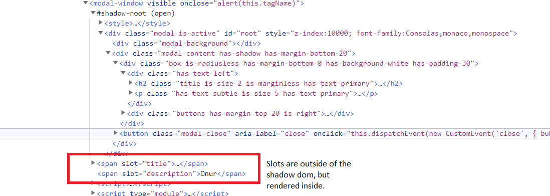
which clearly shows the show dom and other ingredients. An important point is you can see the slotted elements are indeed outside of the web component although from rendering point of view they are rendered inside the slots.